Travel.mil
Travel.mil is an online booking and reservations platform serving government and military personnel for over 20 years.
Role
User research, prototyping, and interaction design. Information architecture diagraming. Market research.
Results
Improved user satisfaction with customer agency. Decrease in Help Desk tickets. Increased cost savings.
Project Overview
Travel.mil is an end-to-end travel management system helping over 100,000 daily users book official Department of Defense (DoD) travel reservations. New DoD security mandates required updates to the back-end technology prompting a redesign of the outdated UI. Initially, some initial success with other modules within the family of systems, the Program Management Office (PMO) began strategizing future updates. The next major release focused on redesigning the reservation booking system, which included four distinct modules—air, lodging, rental car, and train—each with complex, interlinking workflows. Recognizing the scale of this challenge, I successfully advocated for the addition of three additional UI/UX designers to the team. As team lead, I prioritized a strong research and design approach to ensure we avoided past mistakes.
A New Approach
Over several weeks, we conducted an in-depth study of the existing reservation systems, creating journey maps for various traveler workflows. We developed sitemaps and information architecture diagrams, which allowed us to visualize the menu structures of each page and the relationships between them. This detailed approach enabled me to effectively plan and manage the design team’s deliverables, as well as monitor progress throughout the design process.
Journey Map
Information Architecture Diagrams
Process Improvements
As the UX team progressed with the designs, I recognized the need for significant improvements to our Agile process, particularly in our approach to requirements gathering, which was crucial given the scale of the reservation project. Leveraging my 10 years of experience in Agile environments, I proposed a new process model to address past challenges. We implemented weekly design sessions with the PMO to discuss new ideas and review wireframe designs from the previous week. Vetted designs were then sent to development teams for feasibility studies and task estimates. This approach allowed me to present findings directly to the PMO and effectively monitor the project's progress across multiple design efforts.
Design Process
Overcoming Obstacles
Designing within established policies and business rules presents significant challenges, as any idea must align with these constraints to be viable. The reservation system in Travel.mil was a prime example, with a well-defined problem space but hampered by the government’s complex business rules and policies. Users often had to navigate confusing pop-ups and disclaimers to select their desired flights or accommodations.
My goal was to align Travel.mil more closely with the user-friendly experience of commercial booking systems, while the PMO prioritized adherence to contractual obligations with vendors. I also discovered that the legacy system had been deliberately designed to make certain choices less accessible to users. Determined to modernize the reservation experience, I initiated competitive research analysis to explore ways of integrating contemporary design trends into the system.
Competitive Analysis
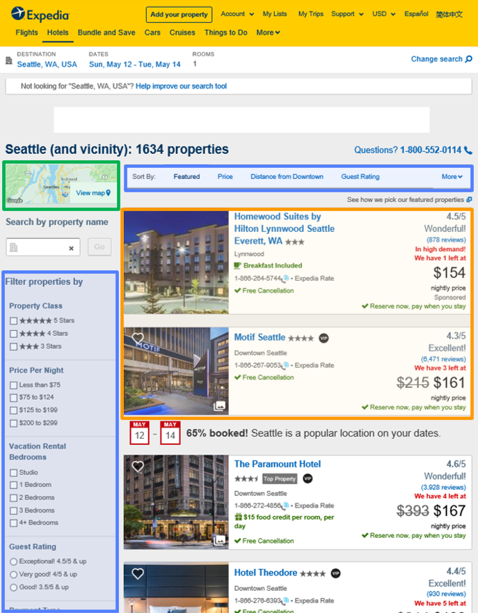
Expedia
Hotels.com
Hotwire
Kayak
Using lodging reservations as a starting point, I began to study a variety of commercial sites. Every website I found was broken down into 3 distinct sections: search result filters, hotel result cards, and a mapping component. The hotel result cards also prominently displayed a “recommended” option emphasized at the top. Perhaps I could implement something similar into Travel.mil. I reached out to the engineering team and asked them to begin looking into a mapping solution. Fortunately, the customer had already approved the use of Google Maps in a previous effort. I created some initial sketches and reviewed them with my design team.
Low-fidelity Wireframes
Lodging Reservation Process
High-fidelity Wireframes
Lodging Search Results List View
Lodging Search Results Map View
Lodging Result Card Details
Room Selection Page
Lodging Confirmation Page
Scaling the Design Process
Following the reservations redesign, I divided the team into three functional areas to complete the per diem, accounting, and digital signature modules. Managing these concurrent efforts required a Travel.mil design system, daily scrum meetings, biweekly internal reviews, and weekly design feedback sessions with the PMO and members of the user community. Using Axure RP and other design tools, my team and I were able to rapidly prototype and test our designs with stakeholders to determine if we were on the right track or needed to pivot.
On more than one occasion, we needed to adjust our designs because they were impractical or were misaligned with user personas. For instance, while redesigning the per diem module, we initially designed a screen with ample whitespace thinking it would improve readability. However, user feedback revealed that lengthy trips were common and users wanted to see more data on one screen. We pivoted the design, collapsing like days together in a more compact view. This tested very well with users and was eventually rolled out into production.
High-fidelity Wireframes
Per Diem Page
Expanded Per Diem Page
Results
After the lodging reservation redesign went live, we saw a 60% decrease in bounce rate from the application as measured by the number of abandoned travel reservations. The update also caused a 45% increase in daily active users since it was now easier and more intuitive for users to fill out their own travel requests. The PMO was pleased with the new design, surprised that Travel.mil could adopt such a modern approach. By prioritizing “DoD Lodging” results when available, I ensured compliance with the multi-million dollar vendor contracts while presenting every available option in one unified list. User surveys indicated that the map integration, a long-standing feature request from our user community, and the improvements to the per diem screens improved customer satisfaction with Travel.mil by over 85%. This redesign marked a turning point in my relationship with the PMO, as they began to recognize the value of a dedicated UX team and trusted our expertise and the enhancements my team and I made to Travel.mil ensured its relevance for years to come.


